Monday, 15 June 2009
Tuesday, 12 May 2009
Sunday, 10 May 2009
Wednesday, 6 May 2009
Wednesday, 29 April 2009
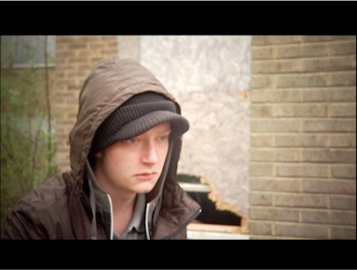
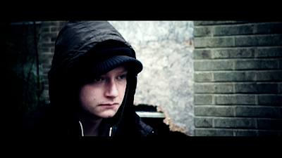
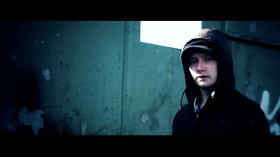
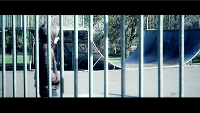
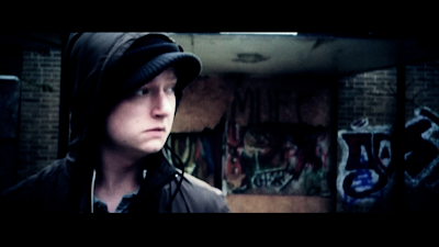
Screen Grabs From Truce Film - Final Year Project
Before colour correction
After colour correction
Tuesday, 11 November 2008
Crime - One week brief
For this university project, we had to turn a negative into a positive. I took the fact that crime is positive if you are the criminal. This then led onto the the fact that crime is a main part of our economy and without crime, unemployment would rise even more thus creating more crime due to desperation.
Robocop Trailer - Uses Terminator Music
Because this trailer came out before Robocop's music was completed, so the Studio thought they could just use Music from the their other hit about a cyborg. The Terminator. Both were produced by Orion studios and both are winners
Wednesday, 1 October 2008
Conrad Ostwald - Showreel 2008 Watch and be amazed
What an example of how a showreel should be done that promotes every skill you have to offer.
Monday, 29 September 2008
2FRESH - Can Burak Bizar
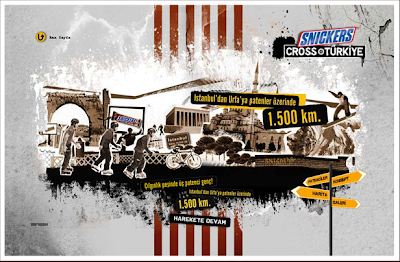
"Snickers Cross Turkiye” was an event about three roller skaters skating throughout Türkiye within 2 months, with the slogan “Keep Moving". So, being consistent with the event, our solution reflected the street culture and the spirit of roller blade; while appealing to the core target group of Snickers, mainly the youth.
The art direction of the web site is based on street life, wall and asphalt textures and road signs. In the core of the design, they created an illustration combining the main sight-seeing elements on the route on a sliding strip, which moves along with the three skaters. They say they used crappy 2D character animations for skaters and combined them with 3D street sign navigation. They also employed a selective yellow-brown color palette and flat textured graphics to communicate the visual style of the event in a Snickers® branded way.
Skrilla

Walsall based Skrilla designs album covers. They look to be in a similar style to that of the photography of Dave Hill. "My life-long love of music crossed over into design when I began working as a full-time freelance designer in 2006. I always enjoyed actually buying music and owning the full product with the artwork and booklet, rather than just listening to the music, and that's how I really started to think about getting into the music industry and designing myself," he says. "I got my first real break in 2006 when I hooked up with Midlands-based record label Wolftown Recordings, and from there it was all go, using the internet as a networking tool to reach clients based anywhere from the UK to the United States, and as far as Japan."
Skrilla says the freelance life is the way for him: "I feel really optimistic about working freelance right now, as it allows me to be creative in the field of design I love."
KJA Artists - Matt

Over his 20-year freelance career, Matthew has worked on a variety of commissioned projects from art and illustration agents, as well as from his own clients of design agencies, publishers and manufacturers. He's experienced many changes in the design industry: "The biggest challenge was making the change from traditional airbrush to digital back in the late 90s."
The Batman project was a commission for the Dorling Kindersley Bat mobile Owner's Manual in December 2007, and one he thoroughly enjoyed. "It was important to make it look believable, but at the same time have a feel of 'Bat technology'," he says. Another of his commissioned projects was Muscle -part of a series of anatomical illustrations for Carlton books in April 2008."The most important part of this project was making the textures look organic, but keeping them relatively simple," he explains. "The challenge was getting the exaggerated perspective of the different layers to look okay, while keeping a sense of scale that allowed all the parts to be easily understood."
Paul Novak
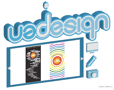
Born in Hong Kong, Novak moved to the UK at the age of 8 and has always been an artist. Working in areas including illustration, graphic design, typography and street art, he officially became a designer in 2006, and now works for Lomax Systems Ltd (LSL).
The first real design of his that LSL produced was a banner, created in December 2007. "I like the fact that this piece shows the variety of content available from the company as well as the style," says Novak. In June 2008, Novak produced a self-portrait by placing a hand-drawn sketch from his pad into Illustrator and vectorising it. He created his own style of character, taking inspiration from the Best of Blur album cover by Julian Opie. Feeling he needed an identity, Novak was inspired by the books Los Logos and Dos Logos to produce a business card that could be read both upside down and normally, in order to create "a little interaction, brain challenge and fun".
Anthony Furlong
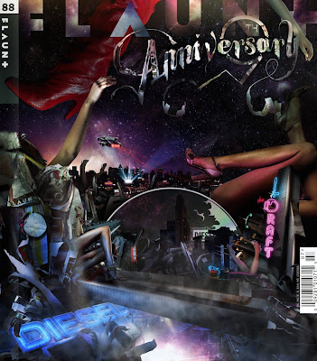
http://www.anthonyfurlong.com/
Design director Anthony Furlong spends most of his time working on commercials and other broadcast projects. The images opposite are from a three-minute piece commissioned by Royale (www.wearerpyale.com) and sponsored by Diesel. "Royale asked me to use the Diesel imagery along with actual tears from the magazine," explains Furlong. He was also commissioned by Brand New School (www.brandnewschgpl.com) to create a pitch for Starbucks Chocolate. "The commercial used the chalkboards that their baristas use in their stores. I always jump at the chance to design things outside of the computer, to use real [and] digital elements."
David Troy
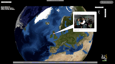
Flickrvision is the brainchild of American entrepreneur David Troy, who has been working in technology and graphic design for over 20 years. Curious about the flow of visual data around the world, and inspired by the success of his last project, www.Twjtteryjsipn.com, David Troy created the mashup site in May 2007.
"1 thought that visualising pictures from around the world in realtime would be compelling," he explains. "I really like the framing of the large-sized photos (seen when you mouseover the small photos). When I travel, I wilt often stop by an Apple store and put Flickrvision onto a current iMac - the ones with the nice black and silver screens. It really looks great."
Troy re-used a tot of the code and structure that he used to create Twittervision. "Getting the data streams to work was easy," says Troy. "But getting the picture data, geolocating it, saving that and spitting it back out was a challenge that took some time to master, though I had some experience with that general process in doing Twittervision."
Justin Lerner
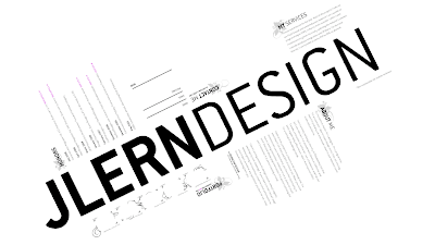
http://www.jlern.com/
Justin Lerner is a 27-year-old freelance interactive designer who specialises in innovative flash websites. His personal site, which was created as a tool to promote his abilities and freelance projects, took a total of a month to complete. "I enjoy its simplicity and the use of typography to push the design," says Lerner.
The project took a lot of planning before he started work on it in March 2007. "It was hard to decide on a system of navigation that I knew would be innovative, but would also not be difficult to use or annoying to users," he explains. "A lot of thought went into how it would fill the screen on different size monitors and still look good. And it was difficult getting the artwork for my projects to look acceptable, after being zoomed and rotated."
Clusta Ltd
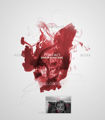
Clusta specialises in intelligent design and digital innovation. The company has been working on digital design, web design, branding, print, 3D and video for over 10years.
This innovative site for American agency Hal Riney can be navigated either by mouse or by webcam. "We didn't want the webcam option to be a gimmick," says creative director Matthew Chugston, "and we felt it was important for this element of the site to function as well as the mouse. So we researched computer games that have utilised similar technology."
The site's aesthetic uses red ink in water to symbolise new blood in the company, so Clusta filmed ink in a fish tank and then comped it all together in After Effects. "Separate ink flows were rendered out of AFX with alpha channels and the coding was then done in Flash," he explains.
group94

Fully booked for months in advance, Flemish web design agency group94 decided it was time to refresh its company website. The result, which took two months to build, is no ordinary site. While the content itself is relatively straightforward - a news section to explain the agency's approach and showcase some of its work - it's the functionality of the site where things start to get interesting.
"We wanted to showcase our CMS too and decided to include it on the site as well," explains founder and creator Pascal Leroy. "Hence each page has two sides; the actual webpage can be flipped over to reveal the back-end CMS functionality. Visitors are invited to alter the content - they can even upload images and experience its ease-of-use."
Inventing the concept of a double site and CMS was the easy part. The difficult bit was building it, and allowing people to change content. "Integrating typical HTMLfunctionality - use of browser buttons, deep linking, page history and search engine optimisation - to the project was quite a challenge," Leroy says. "More than one would imagine during a simple visit." But it was worth it. "We're happy with the whole project. It generates a lot of very positive feedback."
Firstborn & T.A.G
Firstborn, a multiplatform design and technology studio, creates everything from websites and viral campaigns to 3D models and digital applications. For the new Microsoft Zune player, it was approached by T.A.G to be its interactive partner on the promotional site. The brief was to develop an experience that acted as a journey for the user - an experience that would allow the user to spend some time with the Zune. "We came up with the idea of having six unique worlds - one for each core feature of the Zune," explains Firstborn's executive director Dan LaCivita.
Launched in mid-November, work on the site began in September. "We're pretty proud of all the animation," LaCivita continues. "Our team of Flash animators worked countless hours on animating every single element for every world. While our lead Flash engineer created this amazing 3D world with pretty sophisticated ActionScript, our animators used cell animation and timeline animation to really bring the Zune worlds to life.
"One thing that was difficult was how our designers and animators had to use the 3D engine created by our programmers to help inform the way they worked. Since there are many elements and a lot of animation, we had to do a lot of testing throughout the process to make sure the loading and performance of the site was optimal."
JUXT Interactive - cherry coke myspace design contest

Todd Purgason, Co-Founder & Creative Director, JUXT Interactive Well beyond color and motion, Todd focuses on distilling business objectives into actionable creative solutions for JUXT's roster of international brands. Over ten years of international acclaim are a testament to his deep understanding of how to integrate technology and design in order to create a more engaging user interaction that meets business objectives, while delivering uniquely branded experiences. Todd's work has been lauded by nearly every design and advertising authority, including the Clios, Communication Arts, HOW, the New York Art Director's Club, and the Cannes Lions. He is a member of the International Academy of Digital Arts & Sciences, an author of a best-selling book on Flash design, and an avid XBOX'er.
Darkroom To Digital - Book

This book describes the author's `journey' in traveling from the use of analogue techniques to digital techniques of image creation. The journey was fascinating all the more because it was not trouble free. As problems emerged and options presented themselves, decisions were made and lessons were learned. And the author is still on that journey, because, in exploring the new possibilities that digital techniques bring, discoveries are still being made
Sunday, 28 September 2008
Bob Cheshire
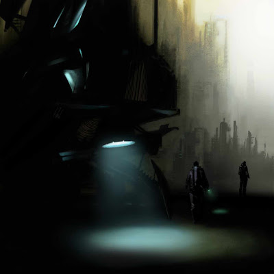
http://bobcheshire.co.uk/
Bob Cheshire is a 35-year-old senior concept artist, currently working at Volatile Games, a division of Blitz Games Studios (www.blitzgamesstudios.com) on a top-secret title for a well-known producer: "It is incredibly frustrating that I'm not able to discuss the game or the concept work I've produced for it, as it's still in full development." While he can't give anything away about his most recent project, he is enthusiastic when singing the praises of his employer: "Blitz Games Studios is an awesome company to work for. I get to work with the best artists and animators, and the company feels like it's growing by the day with the ever-increasing amount of fresh directions and games it is taking on."
The British artist has always been interested in design, but finds it difficult to pinpoint the exact moment when he knew that it would become his future career: "We're visually orientated, so we are always assessing design in some form, whether it's graphics, architecture, a texture or simply appreciating a shape or colour. I think I've always enjoyed and been interested in colour and shape, and it's simply been through education and experience that my appreciation has developed into a kind of formal understanding. I guess there was no singular moment I signed on to that."
He uses both Painter and Photoshop in his work, often switching between the two: "Things like custom brushes, while possible in Painter, are so much more workable in Photoshop. Selection tools and the versatility of editing your images are just so much more subtle in Photoshop. The concept artist has an art director to please, so the ability to edit and modify your artwork is simply part of the job. Certainly in that way, I can't imagine being without Photoshop."
Cheshire studied Fine Art at the Falmouth School of Art (as it was known then), before doing a PGCE. He taught art for ten years in secondary schools, but began freelancing while he was still teaching. Nowadays, he works on both his day job and as a freelancer: "I'm extremely lucky that I'm in a position where I'm taking work on in the evenings too, as I continue to do some freelance work for old and new clients." He also occasionally teaches at the Compton Verney gallery: "Compton Verney is far more fine-art based. But it serves as a good reminder that working as a concept artist relies on strong, traditional drawing skills." This is something that Cheshire thinks is extremely important: "Art education is important, but it is usually one of the first things that is squeezed out at schools. I'm a big believer in creating students who are visually literate and who are able to have a dialogue with all this visual information that we're surrounded by. Traditional drawing skills are becoming less and less valued unfortunately, especially at degree level, which professionally I find appalling."
Darek Kocurek
.jpg)
http://www.darekkocurek.com/en
Darek Kocurek is a zealous editorial artist with a passion for the mystic and macabre. With a self-confessed style that oscillates between fantasy and horror, he explains: "Partly it results from my interests, from my cooperation with Polish and Dutch Stephen King fan clubs and working with similar publishing houses."
Having produced numerous examples of book cover art and currently working with three European publishing houses, Kocurek immerses himself heavily in his favourite industry area: "Currently I am making several illustrations for book covers," he reveals. It was in the same industry area that he obtained his first commission. "My first order was connected with my involvement with a Polish Stephen King portal, for which 1 made calendar graphics. A publishing house that was searching for illustrations for several reissues of Stephen King's titles noticed my works."
Being in the right place at the right time, and consistent in the delivery of his art to appreciative online viewers, can account for Kocurek's commercial success. But he also expresses his determination to succeed through personal creative development: "In the field of computer graphics lama self-taught person, for many years 1 Nave been using numerous 2D and 3D programs, trying different techniques. My adventure with computer graphics started in the Nineties, when I bought an Amiga computer. During the following years I changed my job several times, and even though I have been working as graphic designer, I am able to identify many forms of computer graphics such as animation, 3D graphics, visualisation, printing and typical commercial art."
After such deliberation and exploration of mediums, Kocurek's conclusion was testament to our favourite software: "Nowadays I work mostly in Photoshop. It's a perfect tool for photomanipulation and it allows typical painting operations at the same time. After collecting materials, I start dressing in Photoshop. Usually I try to connect photomontages with 3D graphics and/or matte painting - often in a way that makes it clear to the onlooker which is the picture and what is added."
Saturday, 27 September 2008
Stefan Morrell
http://stefan-morrell.com/
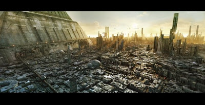
Stefan Morrell is "for the most part self-taught" gleaning valuable information on digital techniques from books and the internet. However, looking at his images you wouldn't think that this pro fell into producing art 'accidentally'.
"I've always been interested in the arts in one form or another, but moving to the digital medium was perhaps more accidental than anything else - the culmination of trawling the internet for art sites when first getting a computer several years ago," Morrell explains, "It was seeing websites like CGTalk.com [CG Society's forum] or Renderosity that really got me interested. My ideas of digital art were of it being very sterile and lacking in any 'life'."
Those websites also helped to launch Worrell's digital career: "Most of my first jobs have come through having a portfolio online; consequently, the majority of the enquiries I get start off, 'We saw your work on CGTalk.com'." As such, Morrell is happy to extol the virtues of the internet portfolio: "Having an online exposure is a great way for various clients to get a good look at the style of my images. It also helps to work with overseas clients, being based in New Zealand."
Morrell's work obviously uses a lot of 3D techniques, but Photoshop certainly has its part to play too. "There is a large amount of 3D in my images, which is created using 3ds Max and rendered in multiple passes for postworking in Photoshop," he explains. "The 3D models need to be textured before rendering, so I also make use of Photoshop for textures, most of which are photo sourced and colour corrected, layered up and given some life with custom brushwork. The texturing process is probably where I do most of my Photoshop work."
So what's next for the talented "environment artist"? "I'm currently doing some illustrations for an upcoming Honda ad campaign, creating vast sci-fi cityscapes for high-quality magazine prints. For the kind of images I like to do, it's the dream job!"
Alex Jansson - Illustrator
http://www.alexanderjansson.com/
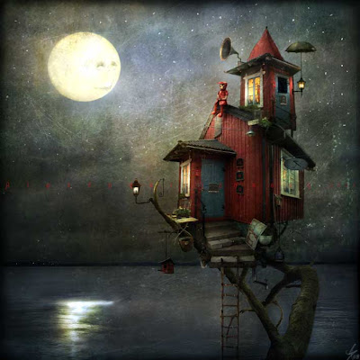
At the beginning of Alex Jansson's career there was a program called Picture Publisher. It was free, easy, but very limited. "Photoshop scared me," admits Jansson, a freelance illustrator working in Gothenburg, Sweden.
"For five years I went to art school and then tried my luck as a traditional oil painting artist. Meanwhile, I got more and more interested in experimenting with the computer and I slowly started to develop my style."
Jansson's success is an inspiration for all. After starting to show his digital work at art communities online, he received an overwhelming response. Soon he had his own website up and running, and around that time the commissions started to trickle in. He's now a lot less daunted by the ins and outs of Photoshop. "In my opinion you don't need to know a lot of technical stuff to master Photoshop," says Jansson. "The most importantthing is that you have a clear vision of what you want. I use Photoshop the way I paint, with intuition and a loose', straightforward kind of attitude."
Jansson is currently working on a film called TheCuriousKind, exam project for his Bachelor's degree, which takes up most of his precious time. "I'm also putting the final touches to my children's book called Boats/nan And The Stranger. Then there is this ever-ongoing process of creating the world that most of my illustrations are part of," says Jansson. "It's been a part of my life for the last 15 years and a book is slowly taking shape."
Friday, 26 September 2008
Pontefract Museum
Walking round Pontefract with my uncle the other day was the most intense history lesson about one location I've ever had to endure. His local knowledge is immense. You can imagine what it was like walking around the museum. The Museum itself is in a flamboyant Art Nouveau building with a tiled entrance hall with many original 1904 furnishings.
The collections themselves include finds from Pontefract Castle and St. John's Priory, siege coins from the English Civil War, packaging from the Pontefract liquorice factories, Bagley's glass and a major archive of locally printed material. Most of the collection has strong associations with Pontefract, including the town's mining history.
Pets with Tourettes
Whilst perusing through Borders the other day I noticed this book in the recommended section. First of all i though how does this stuff get published, but i found myself flicking through the book anyway. Before I knew it I was at the last page laughing my head off.
The work combines comical and cute animal photos with inappropriate captions to tickle the belly of animal lovers everywhere. Tourette's isn't funny but you can't help smiling at theses furry friends. Has an appeal to the wicked in all of us! Bad language, bad taste, great photos.
Wednesday, 24 September 2008
Granary Wharf - What a film/photo location!
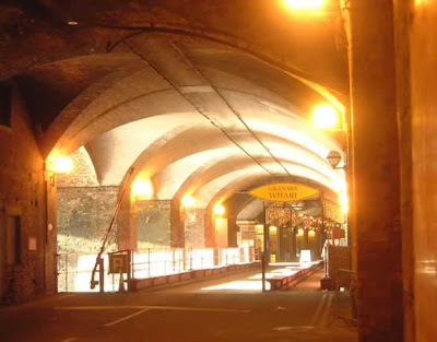
I had been looking for a closed off area for somewhere to shoot a music video. I needed a grungy area that had a well lit overhead light so that i only had to use a few halogen lamps for the band themselves. Will probably apply the vignettes and stylize it with MagicBullet in after effects. Just need to make sure its well lit.
The car park areas down in granary wharf are ideal. They are like closed of compartments under the arches that have worn brick and overhead lighting on 24/7. If you need to fill up on your stock photography or grunge textures, get yourself down there with a camera and start snapping. I just need to find out the legal implications of filming down there now and all should be good.
Tuesday, 23 September 2008
Death Race - Floating heads ... Again!
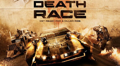
I feel like maybe they got this one backwards. When looking at the bottom of the poster you see some explosive cars bursting off the page. I like the bottom 40% of the poster and think if that was blown up to take over the whole thing, we’d have a nice little image on our hands. Sadly, they went with the straight-to-DVD style poster of floating heads.
Trouble with the floating heads is that it has been done to death and we now associate it with titles that have gone to DVD. It's like using Trajan Pro for your premier image and the DVD cover.
Above i have included a cut down version of the actual poster, removing the floating heads. Let me know what you think about floating heads on film posters? Do they always work?
Shop Graffiti/art

After a trip to Newcastle i found this image in a shop window down by the Quayside. Using the typical "closing down" snow spray paint to create this bit of crazy artwork seems to be the idea of David Hoe. You could read deeper into this by saying that the idea of the guy blowing his brains out, thus ending him, could symbolize the closing of the store. To be honest though, i think he just wanted to paint a guy shooting himself through his mouth. Amazing what you see around.
I've tried to find more of his work elsewhere online, but he seems to be a mystery man. If anyone finds anything, throw it my way please.
Demonic Toilets

Whilst in Sandbar in Horsforth the floodgates inevitably opened and i had to pay a visit to the little boys room. On entry I saw these dudes hanging on the wall so i had to get the camera out. Thank god no one else was in there, could have been arrested. They are the work of Andy Thornton, an experienced interior fit-out contractors with an international reputation for creating some of the best bar designs and interiors around the world.
They either work with clients' own designers, manufacturing to their brief, or they offer a full design, build and installation service. They specialise in the full joinery package, including bar counters and backfittings and fixed seating etc as well as providing decorative glass and architectural metalwork where required.

The Art House

Wakefield’s Art House was designed by architect firm ‘Allen Tod’ to provide space for artists to produce and present their work. The building has a very functional feel to it though, rather than the typically imagined “inspiration den” that most artists surround themselves with. When I was walking around the corridors, it reminded me very much of a modern school building. Clinical white walls and rubber moulded handrails seemed to overpower the actual gallery of artwork that was on offer. Saying that though, all the artists who were renting the space seemed really happy with the building as it let in a lot of light and gave them plenty of room to work. They are happy for anyone to bob in and chat to them throughout the day so if you are in “Shakey Wakey” have a bob in.
Bradford photography museum
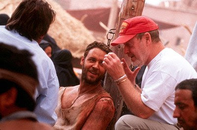
While some studio photographers concentrated on creating the star image, others worked on set, alongside the director and crew, to produce publicity photographs for each film. Such unit stills photographers have to capture the essence of a film without disrupting its production.
Of the thousands of stills taken, only a few are chosen for press publicity. Until the 1960s, photographs were also reproduced as lobby cards, publicising films at cinemas. Today, the photographer’s work is used more widely – for posters, DVDs, books and other film-related products.
The Invisible Art - book
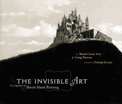
Since the birth of cinema, movie-makers have created stunning special effects by combining still "matte" paintings with live-action film. Matte painting techniques were closely guarded secrets that never left the studio lot.
When I read this book I was amazed by the standards that some artist set with their almost life like flat images. Pure talent.
This book covers the history of the visual effect with shots from Gone with the Wind and Citizen Kane to Star Wars and Titanic.As an extra bonus there is a foreword by George Lucas and a CD-ROM that shows the paintings in action with footage.
Subscribe to:
Comments (Atom)


